Structured data explained
How to change image dimensions in HTML?
The practical ways to size images on a page: HTML width and height attributes, CSS sizing (including responsive patterns), and when to use srcset and sizes.
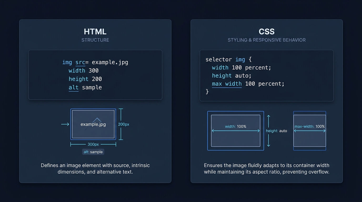
Change image dimensions on a web page by setting size in HTML and CSS. Use the img element’s width and height attributes to establish intrinsic dimensions and reserve space, and use CSS width and height for layout control and responsiveness. For responsive file selection, use srcset and sizes. See the MDN reference for the full behavior of these attributes and properties (MDN img element).
Ways to set image size
1) HTML width and height attributes
Set intrinsic dimensions directly on the img tag. These values are integers in pixels, without units. Including both width and height lets the browser calculate aspect ratio before the image loads and reserve the right amount of space, which reduces layout shift. Source: MDN img element.
<img
  src="/images/product.jpg"
  alt="Front view of the product"
  width="800"
  height="600"
>
Keep the attributes consistent with the source aspect ratio. The examples use illustrative filenames and dimensions: substitute the actual file and its dimensions before deploying. Changing display size does not resize the downloaded file itself.
Key points:
- width and height are pixel counts (integers, no unit) that define the image’s intrinsic size on the page.
- Specifying both helps the browser reserve space and prevent layout shifts while the image downloads.
Source: MDN img element.
2) CSS sizing for layout control
You can size images with CSS. The img element supports standard CSS properties including width and height, and you can also use object-fit and object-position to control how the image fills its box. Source: MDN img element.
/* Keep images responsive to their container */
img.responsive {
  max-width: 100%;
  height: auto;
}

/* Fixed layout size (may crop with object-fit) */
.figure-cover {
  width: 320px;
  height: 180px;
  object-fit: cover;   /* fill the box; crop edges if needed */
  object-position: center; /* focus area */
}
<img class="responsive" src="/images/hero.jpg" alt="Wide landscape" width="1200" height="800">
<img class="figure-cover" src="/images/portrait.jpg" alt="Portrait subject" width="800" height="1200">Source: MDN img element.
3) Responsive files with srcset and sizes
Use srcset to supply multiple image files and sizes to tell the browser how large the image will be in the layout. The sizes attribute describes the intended display width; when omitted, it defaults to 100vw (viewport width). Do not mix width (w) and density (x) descriptors in the same srcset. Source: MDN img element.
<img
  src="/images/photo-800.jpg"
  srcset="/images/photo-400.jpg 400w, /images/photo-800.jpg 800w, /images/photo-1600.jpg 1600w"
  sizes="(max-width: 600px) 100vw, 50vw"
  alt="City skyline at dusk"
  width="1600" height="1067"
>
Notes from MDN:
- Provide an accurate sizes value when srcset uses width (w) descriptors. When it is omitted, the browser normally uses 100vw rather than measuring the final CSS box.
- When using sizes="auto" it must be combined with loading="lazy"; otherwise include explicit sizes. MDN details the fallback behavior.
- width and height on the element still help reserve space and reduce layout shift.
Source: MDN img element.
Practical tips and pitfalls
- Always include width and height attributes on images to reduce layout shift, especially for lazy-loaded images. MDN notes that lazy-loaded images that have zero dimension before load can cause disruptive reflows. Source: MDN img element.
- Prefer CSS max-width: 100% and height: auto on flexible images so they scale down with narrow containers.
- Use object-fit: cover to fill a fixed box without distortion; use object-position to keep important content in-frame. Source: MDN img element.
- For responsive file selection, provide realistic sizes that match your layout breakpoints so the browser can pick an efficient source. Source: MDN img element.

If you were looking at ImageObject width and height
On-page dimensions are controlled by HTML and CSS as shown above. If you also publish structured data about an image, that’s separate from layout. For structured data how-tos, see our related explainers: Recommended format for schema markup and How to validate schema markup.
Put this into practice
Record the source file’s dimensions and the intended rendered width separately. Check the narrow and wide layouts after loading; changing the CSS box does not change the bytes downloaded from the chosen file.
Quick sizing checklist for images
FAQs
Should I use HTML width/height or CSS?
Use both: set HTML width and height to establish intrinsic dimensions and prevent layout shift, then control layout with CSS. Source: MDN img element.
Do srcset and sizes change the element’s CSS box?
No. They help the browser choose the most appropriate image file for the intended display size; the actual element size still comes from your HTML/CSS. Source: MDN img element.
Published by CheckMySchema.
